Parameters per Study
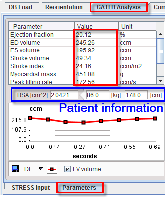
The Parameters tab on the Gated Analysis page shows the gated results obtained for the processed gated study.

The table lists the estimated functional metrics, namely
End Diastolic Volume (EDV) |
|
End Systolic Volume (ESV) |
|
Ejection fraction (EF) |
|
Stroke Volume (SV) |
|
Stroke Index (SI) |
NOTE: SI is provided only if the patient height and weight are available, otherwise it is NaN. Note that these fields can be edited. |
Myocardial Mass (MM) |
|
Myocardial Mass Index (MI) |
|
Peak Filling Rate (PFR) |
|
Time to Peak Fill Rate (TPFR) |
|
1/3 filling rate |
|
1/3 filling fraction |
|
Assessing the LV Time-Volume Curve
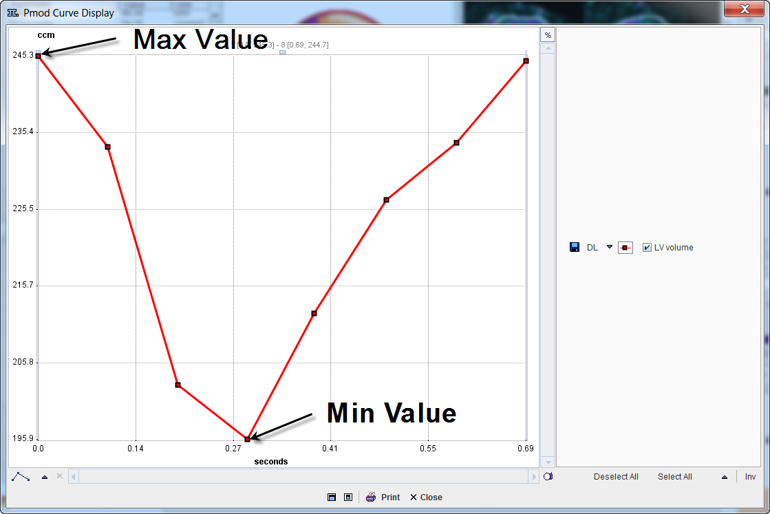
In the plot section the volume of left ventricle is shown as a function of time in the heart cycle. To inspect the curve in a larger window, click with the right mouse button into the curve area and select View in Separate Window from the context menu. The example below shows a typical time-volume curve.

A time-volume curve is expected to have its minimum (end-systole) at frame 3 or 4, and its maximum (end-diastole) at frame 1 or 8 in gated acquisitions with 8 frames. Major deviations from this behavior indicate a gating failure, and the acquisition should be repeated.
Polar Plots
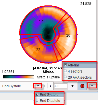
Polar plots are provided for the REST and STRESS studies. The example below shows the STRESS polar plot of End Systole uptake without interpolation and with the display controls disabled. An overlay showing 3 vascular territories (Arterial), 4 Sectors or 20 segments (20 AHA sectors) can be selected from the pull-down menu to right of the overlay toggle ![]() . By default, Arterial definition is used. The + button allows using an explicitly defined maximum rather than the maximum in the data, which can be specified in the adjacent number field.
. By default, Arterial definition is used. The + button allows using an explicitly defined maximum rather than the maximum in the data, which can be specified in the adjacent number field.

For polar maps, the numbers in the overlay represent the average value in the territory, sector or segment.
The list selection at the bottom allows switching between the End Systole and End Diastole uptake polar maps. When the cursor is moved about the polar plot the instantaneous value is shown in the upper right.
The polar plots can be documented by the Polar Plot report. The polar plot display control can be easily switch on/off right clicking on the polar plot area and selecting the Hide/Show Controls option.

Activating the Properties entry in the list, display properties like Description's font size can be changed.
Visualization of the Samples found by Polar Sampling (3D Option required)
The sampling locations for the uptake measurement can be visualized together with the short axis images using the buttons

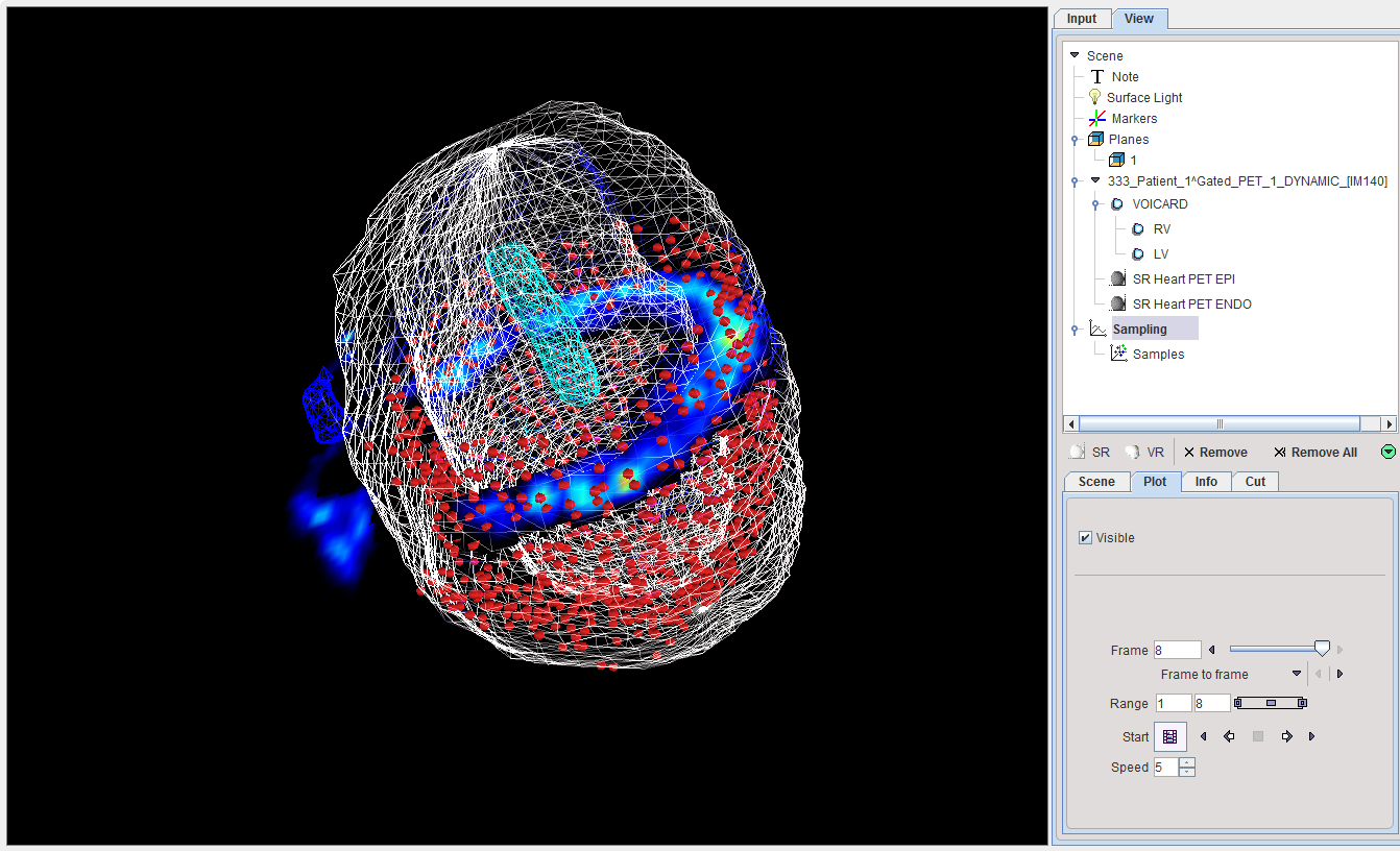
The left button enables the sampling point visualization. The right button calls the 3D tool which renders the shape of the myocardium model together with the sampling points. The example below shows the gate 8 sampling points as red spheres, the myocardium ENDO and EPI models as a wire-frame surface, and a short axis slice of the PET image with contour.

To learn more about the many possibilities exploring the data in P3D please refer to the PMOD 3D Rendering User Guide.